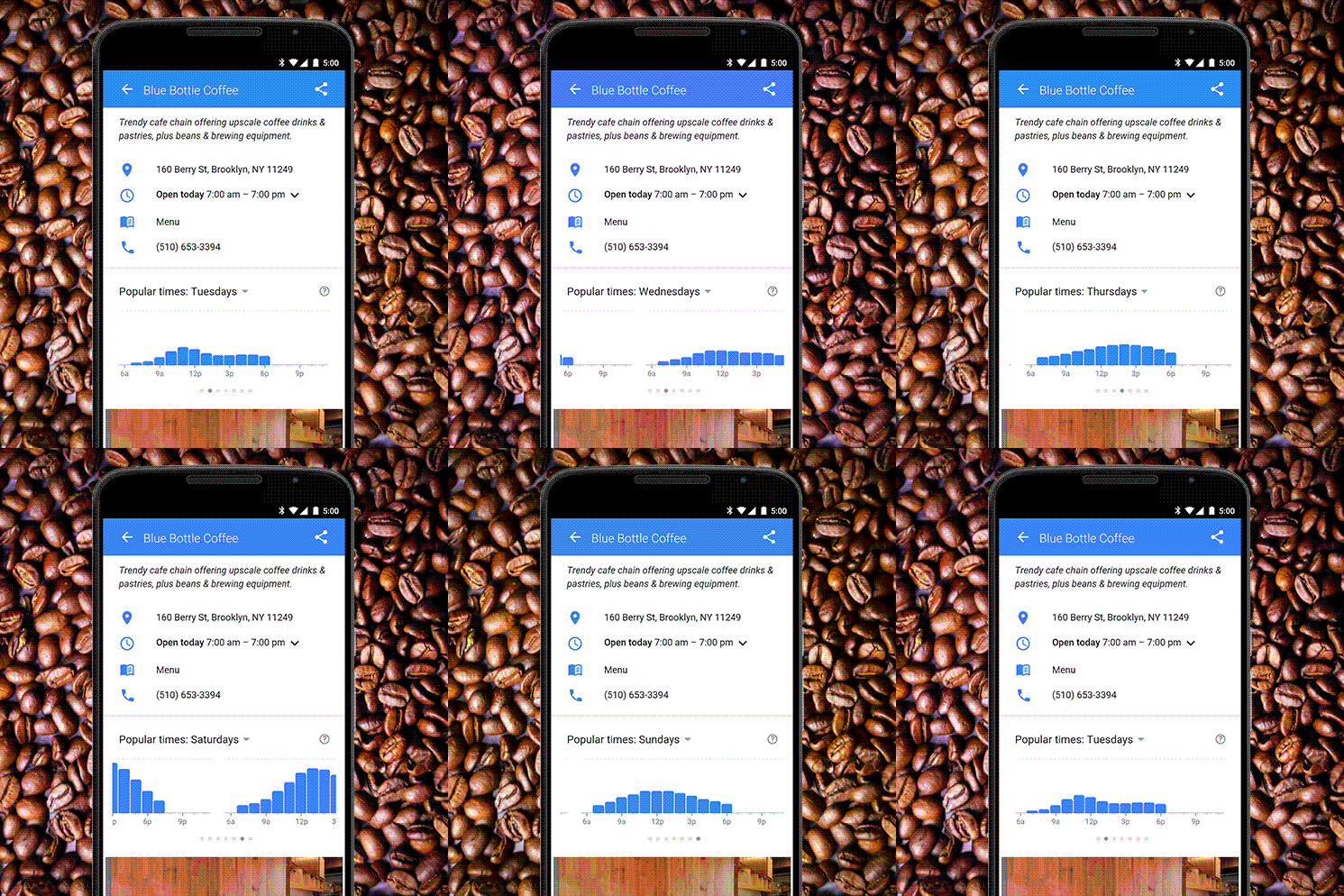
On July 28th, Google announced yet another update to its search engine app, by rolling out a functionality that allows users and customers to see how busy a business is. The update is geared towards helping users identify not only the best place to go, but also if that potential location is too crowded, or in some cases not crowded enough (i.e: Bars, clubs, etc).

The update is geared toward customers and users, however, for businesses it offers a valuable tool in learning more about the local market. Certain trends will be seen throughout you and your competitors, for example, Friday and Saturday nights are usually a busy times for restaurants. What businesses should look out for is if their competition is having a large inflow of customers at a certain time, when no other competitor is.
This allows for further research into why this might be happening. Business owners could then look if the restaurant is running a promotion at that time or if a local organization has a partnership, sending in customers. The thing to remember is that the the charts shown are NOT based on searches but on actual physical visits to the location.
One thing to note though that the information is aggregated by Google users. Thus, the information may be skewed because its not track all the iPhone users who may not be using Google on their phones.
How to Use the Google Update to Your Advantage
Using the tool isn’t the easiest thing in the world, especially because the feature is ONLY available for mobile devices. So the only way to access the data is to search on your mobile browser and then you will have to screenshot the data. There isn’t an option to download the chart or raw data. Why there isn’t a button? My hypothesis is that that would be too easy and Google wants us to work 10x harder than needed to keep us on our toes. In all seriousness, it is most likely for privacy reasons.
Once you have got all the screenshots you needed, upload them to your computer, and from here you can start constructing your analysis.
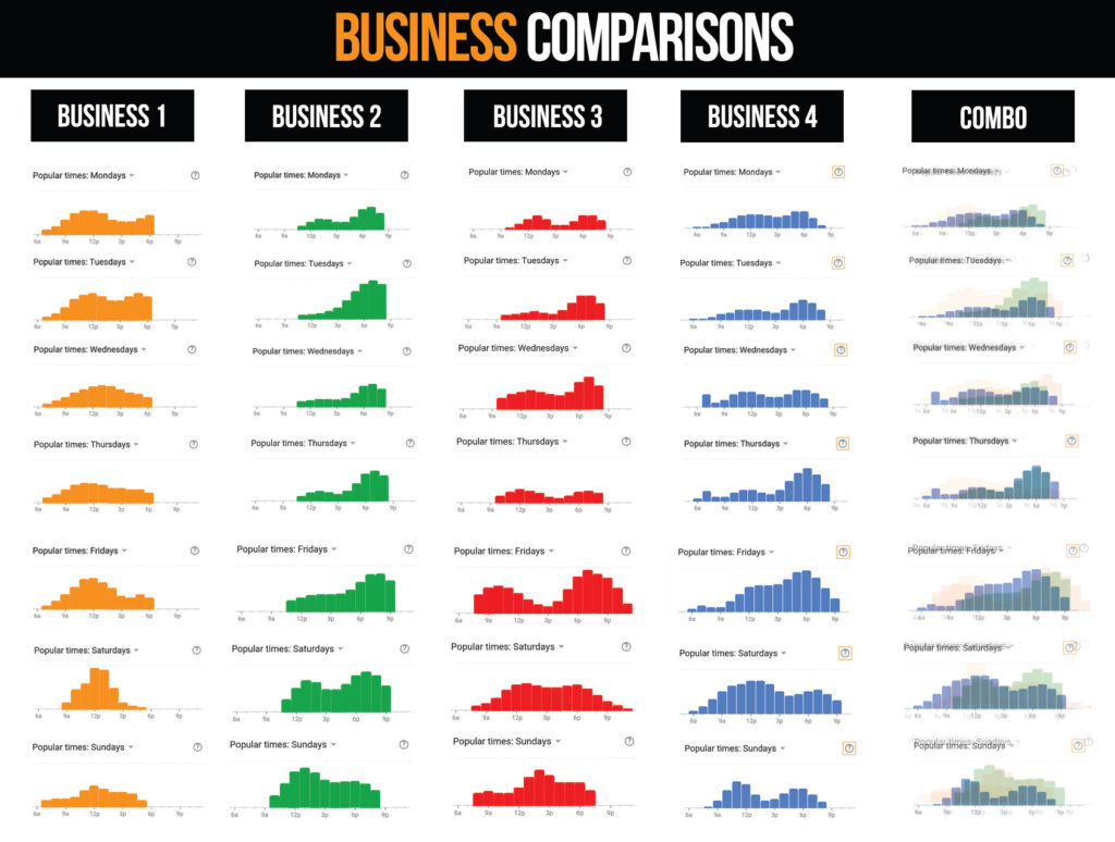
There is some ways to do this, you can either just set the charts side by side for comparison, or if you have the technical know-how, you could also overlay them. (Note: You will have to lower the opacity and then color code, again you will need some technical knowledge to do this) At the end of the day, because Google doesn’t allow you to download any raw data, you will have to be creative with how you set up your models.
Here is an example of how we set up an analysis for one of our clients. We used Photoshop to do this, but there are a number of ways to do this.

Results
You can see from the analysis above that certain patterns and holes do exist. For example, here are some conclusions that you can quickly see:
- Business 4 seems to be performing poorly from Sunday afternoon to night in addition to Tuesday night.
- Business 1 seems to have a much higher traffic count in the morning compared to the other competitors. From here, a business can investigate why this may be happening and try to cover the ground.
- Business #3 is suffering on Thursdays
Taking it from here
Immediately check on your mobile device to see if your business has the data. If it does, plan on making some screenshots and uploading them to your computer. Select some of the competitors and go ahead and start comparing. Here I share: Google Mobile Search Shows Hourly Average Customer Traffic explanatory post.

